I see you are tryin to blend in the pic with the grungy bg but the pics are too opaque(low opacity) they blend in too much... bit like ganguly sig would be better
Gah
Anyone know how to make any of my sigs anybetter? Losing 4 of 5 is kinda sucky, and I thought that at least 3 of em weren't half bad, I knew that I was going to lose the Afridi one from teh start and Oram sucked as well.
Just want to know how I can make my sigs a bit better so I can maybe make that 1/5 a 6/11 or something. Still sucks, but whatever.
agreed ... your work at the moment is too over contrasted mate... like in flintoff's.. he looks too over contrasted and blue ... try to create a balance and some part of sig light and some dark
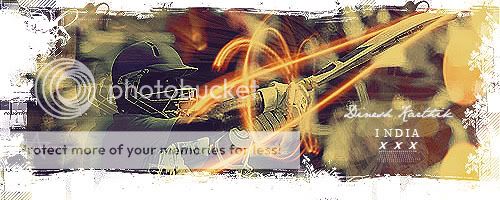
erm i love the BG but blending in render doesnt mean to colour it in Yellow lol... You need to mix n match .. Blending doesnt just mean same colour as the whole BG
This site uses cookies to help personalise content, tailor your experience and to keep you logged in if you register.
By continuing to use this site, you are consenting to our use of cookies.
")

 ) at something like this. Thanks to the tut that I found in Matt's pack.
")