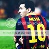
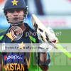
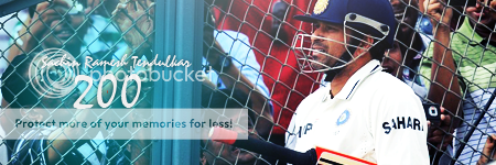
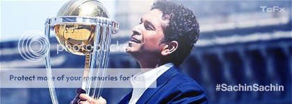
1st one isn't good cos you've made mistake with selective colors.
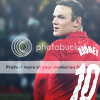
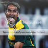
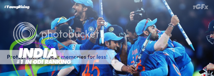
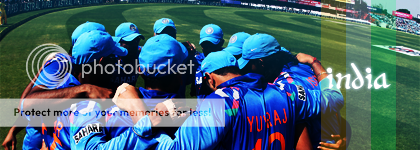
2nd one- Looks empty, light's were good though, Needed some g'maps.
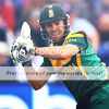
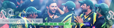
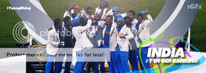
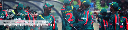
3rd- Very good font and shape work, I feel it requires lighting though.
1st one isn't good cos you've made mistake with selective colors.
2nd one- Looks empty, light's were good though, Needed some g'maps.
3rd- Very good font and shape work, I feel it requires lighting though.
This site uses cookies to help personalise content, tailor your experience and to keep you logged in if you register.
By continuing to use this site, you are consenting to our use of cookies.


")

