You are using an out of date browser. It may not display this or other websites correctly.
No Requests Dipak's Graphics | Some new stuff
- Thread starter Dipak
- Start date

Dipak
ICC Board Member


TheNameisNiru
Panel of Selectors
- Joined
- Nov 20, 2011
- Location
- Bangalore,India
- Profile Flag
- India
- Online Cricket Games Owned
- Don Bradman Cricket 14 - Xbox One
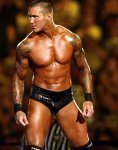
Ava after years or so, comments please. Sorry for the text - on from sis' laptop

looks good for but still lightning should have been a bit higher i feel
Akhil 12
Club Captain
- Joined
- Jun 1, 2012
- Location
- Kerala, India
Aavatars and signatures too, awesome.. thanks for the renders cutout is very good !!!
Aggz
National Board President

Oh, that's a brilliant avatar Dipak! Lightening looks good, maybe a soft brush (opacity around 30-40) around his head, the text certainly needs to be improved but a very good avatar anyways. Keep it up! ")
Viral Shah
International Coach
Ava after years or so, comments please. Sorry for the text - on from sis' laptop
Nice need to work bit more on lighting and some adjustments in colors.
Here i did some minor work on light and color adjustment and this is what i got. And also attaching the psd check it if you can open it in your version of ps.
Text needs improvement though its pixelated don't know why .
Hope u can learn from it somewhat don't want to be teacher here just helping you out in improving which is obviously you want
Attachments

Last edited:
Sulaiman7
ICC Chairman
- Joined
- Feb 16, 2012
- Profile Flag
- Pakistan
- Online Cricket Games Owned
- Don Bradman Cricket 14 - Steam PC
That's a stunning ava Dipak and especially the texts add a lot of beauty to the effects but the effects could be done more . Anyways a brilliant work ! 
----------
You changed the whole look of it , you made it more magnificent !
----------
Nice need to work bit more on lighting and some adjustments in colors.
Here i did some minor work on light and color adjustment and this is what i got. And also attaching the psd check it if u can open it in ur version of ps.
Text needs improvement though
You changed the whole look of it , you made it more magnificent !
Dipak
ICC Board Member


----------
Comments please. Few more coming up
Aggz
National Board President
Good work! Lightening in Gotze needs to be improved a bit, I liked the shapes you used but try some other text (JaneAusten & Gotham to name a few). Well, Ribery looks really good. Tuned up for the upcoming work. 
Meghraj_17
Club Captain
- Joined
- Sep 25, 2009
- Online Cricket Games Owned
The ribery one is good,execution couldn't have got any better,the gotze one looks too plain IMO,even the text version of gotze looks too simple- Place a stock>Random text>Done,the villa one is a decent comeback keeping in mind that you've not touched photoshop for months.
PS:Try playing with shapes along with Light Textures.
PS:Try playing with shapes along with Light Textures.
Last edited:
Umair7
El Presidente
AUS..
Ireland
Kings XI
KK
Hobart Hurricanes
Survival Games Finalist
Avengers
Oval Invincibles

Write TRAITOR too  any way nice work using GOTZE avatar
any way nice work using GOTZE avatar Dipak
ICC Board Member
Write TRAITOR too
:Megh could you elaborate the last point?
Thanks for the comments everyone!
----------
Any avatar requests?
Similar threads
- Replies
- 2K
- Views
- 250K
- Replies
- 1K
- Views
- 92K
Users who are viewing this thread
Total: 2 (members: 0, guests: 2)