Nice start FB.
Try some different effects apart from the box on the BG's.
Matt has posted some really cool fonts, it helped me and it could help u too.
Add stroke to your fonts and it will lift the quality!
Hope my advice helps!
-CM93
Nice going mate! Slight improvement in cutting & use of different fonts wud make more nice.. But it will come automatically with more & more practice.. Its like EA game.. first game we wud find it hard & with days pass by, we will land up even in 17 ball century
This site uses cookies to help personalise content, tailor your experience and to keep you logged in if you register.
By continuing to use this site, you are consenting to our use of cookies.


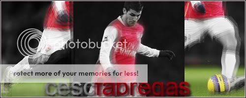


 White sig is excellent.
") i like the White one too as the sharpening seemed to be better
i like the White one too as the sharpening seemed to be better


") Slight improvement in cutting & use of different fonts wud make more nice.. But it will come automatically with more & more practice.. Its like EA game.. first game we wud find it hard & with days pass by, we will land up even in 17 ball century
Slight improvement in cutting & use of different fonts wud make more nice.. But it will come automatically with more & more practice.. Its like EA game.. first game we wud find it hard & with days pass by, we will land up even in 17 ball century