In both versions, the whole sig is too blury especially the render. The top sig would look better if everything was sharper and the background just a little bit darker, I dont mean make it dark just a tad less bright. The second version needs to be very sharp if you wanna do it that style and add text too. Keep practicing mate.
Yeah exactly what matto said. And make sure you put the render layer behind the border layer. Because otherwise the render overlaps the border. Which we dont want
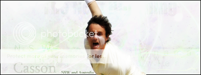
Good work here Ayub. This is your best. Firstly I dont like the shadow render its too bgi and pixelated. You would be better off removing it and adding dark edges. Secondly the background is too desaturated for the render so to make the render blend more put light textures over him, and play with the render effects to make him match the background more. Maybe add some contrast as well.
kiu mate, this is your best no doubt! Despite the critisim I do like it, dont get me wrong
This site uses cookies to help personalise content, tailor your experience and to keep you logged in if you register.
By continuing to use this site, you are consenting to our use of cookies.

")


")