** Dan's Graphics Emporium **

Pranav

ICC Board Member
Joined
Dec 10, 2007
Location
New Delhi, India
Sorry but I'm not a fan of the Bopara sig.

The render his hidden behind the foreground way too much. It looks bland, and the text is pretty average as well. Though, the lightning source behind Bopara looks good.

You can do much better than this.
 

King Pietersen

ICC Board Member
Joined
Nov 15, 2006
Location
Manchester
Few pieces I've done recently:

Iceman.png


MrWonderful.png


DateMike2.png


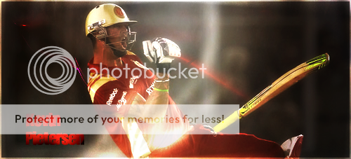
KPAva.jpg


KPsig.png
 

Pranav

ICC Board Member
Joined
Dec 10, 2007
Location
New Delhi, India
Like the avatar. It has good lighting on it. Not a fan of the signature. It's a bit dull. Love the Pietersen signature you made earlier. It's beautiful! :D

PS : try to implement some bright colours to your sigs. They seem a bit dull atm. The avatar you're using is very good but it hasn't been re-sized properly and thus looks awkward.
 

Cricketman

ICC Chairman
Joined
Jul 27, 2005
Location
USA
Looks like the cover of a gay porno :p

Cricketman added 2 Minutes and 34 Seconds later...

Cheers KBC.

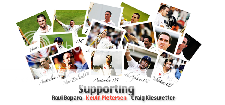
Just made this new piece. Has taken me quite a while this afternoon to put all the shots together (there's one for every Test century KP has scored), add the text and then organise them into positions that I thought looked good. Let me know what you think:

KPCollage-1.png

Diggin' this. Not only does it look good but it actually has some meaning behind it.
 

Users who are viewing this thread

Top