Gary's Graphical Works

attachment.php

That is awesome,your's best.Thanks and Reps added.

Monzi added 1 Minutes and 18 Seconds later...

Oops sorry,i have to spread some reps,Anyway Thanks,will be adding reps soon.
 
liked the first one but sorry now i request could you please make a albie morkel sig exactly like the ganguly one please
 
I like the first one,but not second one.
 
I have forget to post the suggestions,So here it is.
First Sig-Well Nice use of the lightning,A bit more stuffs can be added,but still it is Okay.It could be nice,if the text is added.

Second Sig-Nice Manip,The sig is too light,So it spoils the whole thing.Adjust the brightness and Contrast it will be fine.

Some Colouring tips for manips.If you don't photofilter you can follow it.It gives a good finishing touch.

Colour Fill Layer|Blending mode|Opacity
Seablue|Lighten|30
Yellow|Multiply|30
Red|Lighten|10
 
Thanks for those wonderful suggestions.
Will definitely improve tons.
At least some one cares to comment.
Thanks again.
 
you might use stars in it to fill it some suggestions

1st sig-cool but where is the text render is not cut properly at right the direction he is shouting liked the border but for borders some times use eclipse tool it makes it beautiful and lightning effects proper as i said add some lightnings to fill it or add text and the second render is proper duplicate the first render and set it to overlay and play with the opacity to make it good..

2nd sig-not bad didnt like the blur thing and the text not looking too good use scriptina and trajan pro and to much blurred that i cant see it properly but i liked the hand effect that in the right KIU..to be continued
 
render is not cut properly
Actually it is a manip but with some lightning effect it doesn't seem to be a manip.
I was trying something on this and got this and I was satisfied.
I thought text would spoil it so didn't add it.
Thanks.
 
Last edited:
In the second sig the text is good IMO,Just move it near Albie Morkel,then It is fine.Also burn the edges of the sig,so that the render will be at the focus.
 
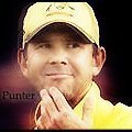
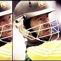
Ponting special-

It was there in earlier PCGMOTW as well.
 

Attachments

  • RP.jpg
    RP.jpg
    24.3 KB · Views: 11
  • RP1.jpg
    RP1.jpg
    15.6 KB · Views: 21
  • RP2.jpg
    RP2.jpg
    19.9 KB · Views: 20

Users who are viewing this thread

Top