Requests Accepted DR9's Graphics Thread| BUMP! (KP Wall)

Are my Logos any good?

  • Yes

    Votes: 29 87.9%
  • No

    Votes: 4 12.1%

  • Total voters
    33
A Collab with meet.
His Start
Virat%20Kohli%20Signature%20copy.png

My Finish (Not too happy with the result :()
attachment.php

 
Last edited:
71388d1275483856-collabs-meet-collab.jpg


Looking superb. Amazing work deathrevenge9.
Just try and remove the two bars over "Virat" and "Kohli", and then the signature would look much better.
 
71388d1275483856-collabs-meet-collab.jpg


Looking superb. Amazing work deathrevenge9.
Just try and remove the two bars over "Virat" and "Kohli", and then the signature would look much better.
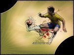
Thanks for the suggestion Bounce but it doesn't look good without those Stroke Lines.
______________________________________________________
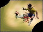
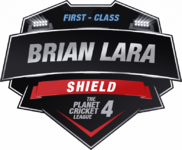
BTW here is the Logo for my Artworks:
attachment.php


It isn't finished yet.I have posted it here to get your suggestions.


Attachments

  • Logo.png
    Logo.png
    4.8 KB · Views: 82
Wayne Rooney Wall (800*600):
v1
71445d1275580775-dr9s-graphics-thread-collabs-my-logo-rooney-2.jpg


(200 Posts :banana)
 

Attachments

  • Rooney 2.jpg
    Rooney 2.jpg
    132.1 KB · Views: 97
Last edited:
You could have put a shadow of him behind the house too. Anyways, good coloring!:)
 
The house sort of detracts from the render

You could have put a shadow of him behind the house too. Anyways, good coloring!:)

thats surely your best
Thank you very much for your suggestions and comments :).
________________________________________________
An Alexandre Wall (Not that good but still looks decent):
v1

v2

v3

(Click)

Made it for PCGMC but then realized that Pato isn't part of the squad :(.
 

Attachments

  • Pato 1.jpg
    Pato 1.jpg
    117.3 KB · Views: 20
  • Pato 2.jpg
    Pato 2.jpg
    113.3 KB · Views: 47
  • Pato 3.jpg
    Pato 3.jpg
    110.6 KB · Views: 25
Sorry mate but its not good at all. The stroked render outlines do not look good.:noway
 
Sorry mate but its not good at all. The stroked render outlines do not look good.:noway
I know.That's another reason why I didn't submitted it.I wasted 2 hours following the tutorial which was of course not very well explained and ended up with this.Since I didn't wanted my efforts to be wasted,I put it here.
 
The tutorial is for "EXPERTS" which you aren't, that's a pretty bad try at the tut, but at least you tried
Pretty much Right :).
_____________________________________________
Few Logos I made for Yashwant Kumar.
Here are the previews:
attachment.php


Attachments

  • Yashwant's Logos.rar
    690.7 KB · Views: 10
  • Varun copy.jpg
    Varun copy.jpg
    185.6 KB · Views: 453
Last edited:
The tutorial is really well explained,But i guess you can't get it right.

TBH poor logos.
 

Users who are viewing this thread

Top