Pak_cricketer
Chairman of Selectors
Hello fellow PCer's! Looking at HP_fan's brilliant piece of work, I decided to start my own little 'portfolio'. Now remember I'm still learning CSS so what your going to be seeing are simple yet effective templates.
_____________________________________________________________
What's Going on here now?
Simple-Listic - V2
What Can I download/get from this?
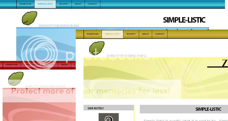
Simple-Listic
_____________________________________________________________
Simple-listic is exactly what it is said to be.. Simple. It includes a Basic little Navbar and a clean interface which is very easy to use. You can use this theme as long as you like as long as you keep the footer the same. At the Moment, Simple-Listic is in progress, I'm still trying to clean up the little bits and pieces which are flying around.
You can See a Preview of Simple-Listic by Clicking Here.
_____________________________________________________________
What's Going on here now?
Simple-Listic - V2
What Can I download/get from this?
Simple-Listic
_____________________________________________________________
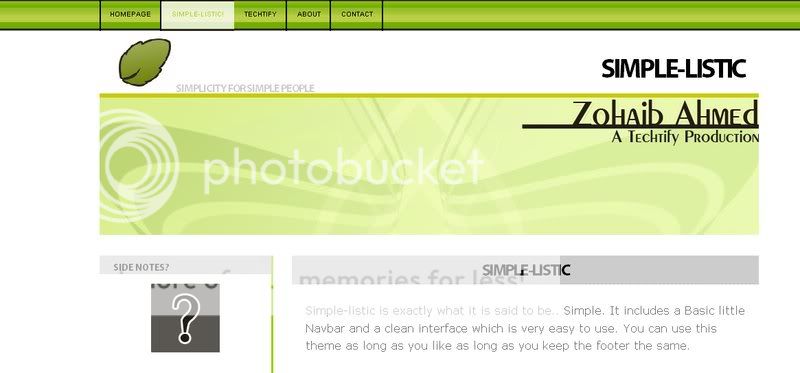
Simple-Listic
Simple-listic is exactly what it is said to be.. Simple. It includes a Basic little Navbar and a clean interface which is very easy to use. You can use this theme as long as you like as long as you keep the footer the same. At the Moment, Simple-Listic is in progress, I'm still trying to clean up the little bits and pieces which are flying around.
You can See a Preview of Simple-Listic by Clicking Here.
Last edited:
") . Would you like to host your templates on
. Would you like to host your templates on