AK's Graphics(new Lmprd sig, KP,R.pontin,dhoni,gilly wall)-plezzzz reply

Ok the bg is awesome, fantastic, love it.
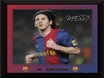
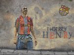
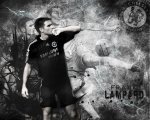
But the pictures look horibale, give them effects and bring them above all other layers.
The text isn't to good either.
But an awesome sig for your first in a while.
 
new saviola sig..........reviews plezzz
 

Attachments

  • saviSig copy.jpg
    saviSig copy.jpg
    38.2 KB · Views: 45
1st wallpaper after a long time........plezzz coment.......
 

Attachments

  • IBRA.jpg
    IBRA.jpg
    237.3 KB · Views: 61
Once again the background works very nicely.. The render looks pretty good but could do with more effects. But i dont like what you do with the text and the font style. Keep practising though and you will get better.
 
hey guys have u seen a rock with saviola and del piero made on it anywhere in the world.................i havent either:D:D but made this on photoshop......chk it out and if u like it pleez coment and post requests ....
 

Attachments

  • savi stone__01 copy.jpg
    savi stone__01 copy.jpg
    54.9 KB · Views: 13
  • delpierostone__01.jpg
    delpierostone__01.jpg
    54.1 KB · Views: 10
hey guys no replies........chkout theses new wallies........pleeez post ur reviews


i can do a tut on the henry wall if some1 wants
 

Attachments

  • prd_maxzoom_CFC628.jpg
    prd_maxzoom_CFC628.jpg
    82.9 KB · Views: 12
  • henry_wall.jpg
    henry_wall.jpg
    565 KB · Views: 24
The messi wall is very good but there is no effects on on the pic inside the box... add colour fill ands gradient maps...
the Henry wall is alright but the text and render aren't very good.
 
IMO henry wallpaper is really good.. nice work and effort,
 
new lampard wall reviews plezzz


btw guys i am leaving again afta eid for college so if some request post soon,,,
 

Attachments

  • lamp black.jpg
    lamp black.jpg
    321.2 KB · Views: 60
arg! Black& white makes it DULL, add some blue and your through for 8/10 ;).
 
Good use of brushes and good idea with the signed text,
but the render could be improved and the bg is also a bit too
bright ;)
Good effort !
 

Users who are viewing this thread

Top